You may have noticed a little change of scenery around here. At the top of my site, there’s a sweet new header and logo, including a killer dollar bill listening to headphones.
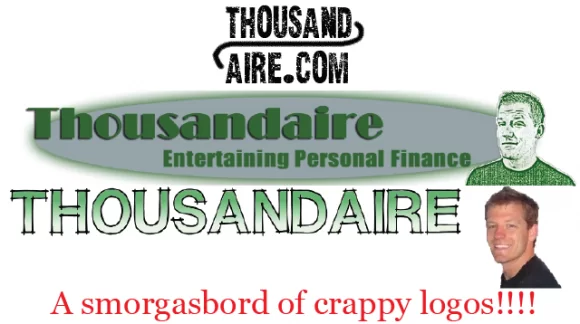
I don’t know how you feel about my new logo, but I LOVE IT!!!! I’ve gone through some pretty crappy logos in the last seven or eight months, so let’s review the turdiness:
Logo 1
This was my very first logo. It actually comes from when the site first started as www.thousand-aire.com (I’m so glad I got rid of that dash!) I just needed something before I could get a better logo, and I tried to integrate the dash on two levels. Super lame, I know. I also used this tiny logo to make room for a stupid advertisement banner across the top of my site. I quickly realized that I’d rather promote myself at the top of my page instead of random companies, although my adsense revenue was surprisingly at its highest with that banner at the top, despite really low traffic levels when my site first started.
Logos 2a and 2b:
Here was my second try. I decided to get rid of the advertisement and put up a bigger logo. The top logo was my first try, and the second is what happened after I sent it to a friend and he made it a little better. I liked this logo for about a week, and then realized that I wanted an actual picture of myself instead of a stupid cartoon. Plus, I had grown to dislike my website design in general. I decided to get a new website design, and a new logo to go along with it.
Logo 3
When I launched my new site design, I did so with a brand new logo. The idea here was to include a real picture of myself and put my site name out there. I still knew that I would want a new logo at some point, but I also knew that I didn’t have the skill to make something good or the money to buy something. This one lasted for about two months until I pulled the trigger on paying for a real logo.
New Logo
This is where I finally got serious about my logo. My website has grown a lot over the last few months (thank you so much to all of you!) and it wasn’t right to have all these new people show up to my website be greeted by an ugly, amateur logo. This website is like my baby, and let’s be honest; nobody likes an ugly baby!
I decided to pay for a logo, but I didn’t know exactly what I wanted and I didn’t like the idea of going to one designer and being stuck with his vision of what my logo should look like. I decided to use LogoTournament, which basically sets up a contest where thousands of designers submit their ideas and compete for the prize money you offer. All I had to do was fill out a bunch of information about my website and what I was looking for in a logo, set a prize amount (at minimum of $275), and wait seven days.
I set my prize package at $326 dollars. I wanted to be at least $50 more than the minimum because I had a feeling a lot of designers wouldn’t participate in contests that only had the minimum prize. Then I made it $326 to hopefully beat out all the people who set a $325 price. I have no idea if I could have gone lower and still gotten the logo I ended up with, but I’m very happy with the results.
The worst part of the experience was the first five days. I only had one or two designers working with me at the beginning and I wasn’t thrilled with the logos they were submitting. I was so discouraged that I started looking up information on the “money back guarantee” when, in the last 48 hours, a bunch of designers jumped in and did some great work.
At the end of the contest, I picked this one out of about 85 logos designed by about 10 artists. There were at least four logos that I though were worth my $326, so it was hard to make a final decision. That’s a nice problem to have though, and I think I ended up with a phenomenal logo that really represents what I’m trying to do here at Thousandaire.
And speaking of that logo, a dollar bill wearing headphones and jamming out to what is almost certainly Haven’t Made a Budget. Never in my wildest dreams would I have come up with such an incredible logo. Thanks Suke!
Future Changes
You’d think now that I’ve paid $326 for a logo, I’d be happy with leaving it alone. Then you might look back at me changing my logo four times in about seven months and realize that I like to tinker. Actually, the only change I want to make is an updated photo that is a little taller. I don’t like the empty space above my head in the photo right now, so I’m going to take a new picture from the chest up. As soon as that’s done, I think I’ll be done messing with my logo for good.
I’m also looking into putting the logo on business cards and t-shirts. I know nobody is going to buy a Thousandaire t-shirt, but I can give them away as presents. My friends and family would love a free tshirt, and I’d love the free chest advertising. It’s a win-win!
So now that my new logo is up, I would love your opinion. Do you guys think it is as awesome as I do? And for those of you that have your own business or blog, would you ever pay $326 for a logo?
Kevin McKee is an entrepreneur, IT guru, and personal finance leader. In addition to his writing, Kevin is the head of IT at Buildingstars, Co-Founder of Padmission, and organizer of Laravel STL. He is also the creator of www.contributetoopensource.com. When he’s not working, Kevin enjoys podcasting about movies and spending time with his wife and four children.


Awesome logo, but $326?? That’s absurd! Does it add value to the site? That much? I would have gone with craigslist, find people to do it for $10 then get designs until you find one you like. That’s how I did my header) and had a friend design the logo)
I do want a t-shirt, however and the logo is awesome. Tell me how to win one, I will go to great lengths for it.
I will definitely have some kind of t-shirt giveaway as soon as I have the designs ready. Maybe I’ll give one away once a month. Thanks for the idea.
If you’re happy with spending the money, then it’s a good investment.
Your logo is your brand. Your brand is the only way you have to add value. While $326 is going to seem like a lot, especially for someone all about personal finance, it’s really pennies in the grand scheme of things.
I’m sure Apple is happy that they’ve spent the billions of dollars they have to build their brand. No one complains that Apple makes too little money selling MP3 players, laptops, and electronics in general with profit margins larger than their competitors by an order of magnitude.
I really like the logo; it’s a lot better than the old one. I’m not one to say that the old one was bad; this one is just that much better.
On the other hand, this comment box is deceiving. Every time I comment I think I’ve hit enter enough, only to find that I need to double tap it. How much would that cost to fix? 😛
I’ll say it for you; the other ones were horrible! I’m glad you like the new one!
I would pay that for an awesome logo. However, I have since discovered Fiverr, and I love what you can get for $5!
Wowza. I didn’t realize logos were so expensive, but it does look nice!
One of the best logo I have seen! It’s awesome. You are doing a great job building up the Thousandaire brand. I’m quite envious.
I definitely like it better than the old one. It’s rad!
love the new logo and yes – you should definitely put up a new pix of yourself and make it a little taller than it currently is. the empty space above your photo definitely needs fixing… can imagine that it’ll look really nice after..the symmetry will be perfect…
Okay…I worked in marketing on the visual end for over 5 years. I picked apart, critiqued, and admonished all sorts of designs. Thus, you are going to get an earful…
The first thing I want to compliment is the layout and structure of your blog. It is perfectly proportioned. It is clear and easy to navigate. (I bounce off a lot of blogs because there is too much ^%&# on them and they are unreadable.)
When I saw your post on the logo, I went to your “about” section. You describe yourself as “good-looking, awesome, hilarious 25 year old…” The icon of the “dancing” dollar…doesn’t describe what you are trying to portray. The dollar looks hokey….and from your picture, you don’t (this is a compliment).
So the question is what does your logo need to be? How should it represent you best? I have the feeling that you are aiming for something with a sexy-savvy-slighly snarky twist? (Did I get it right?)
You really want two things going on. You want an icon. Some image that quickly describes “Thousandaire” and you also need a “look for your blog”. You want to add more personality to it.
I would change the color of the word Thousandaire to blue…blue gives the feeling of classiness and it gives the feeling of that dark blue suit that everyone seems to interview in. I would also consider making the dollar a shade of blue as well and either working in horizontally as the top of the T in “Thousandaire” or having it behind the “T” in “Thousandaire” and off to the left as if is trying to escape or sneaking out.. A graphic designer could make the dollar a bit more playful and then you would have the strong presence of the blue Thousandaire coupled with the whimsical dollar..
The tag line is fine under the logo. This combination of Thousandaire plus your tagline should be your “logo”…this is what you would put on business cards, etc. Your picture is part of the heading of your blog, and I like it on your blog, I just would not consider it part of your logo.
I paid $195 for my logo at Logomojo. I knew exactly what I wanted and during the first round, I achieved about 98% of what I wanted. I did have to have a freelance graphic designer typeset my contact information for the back of my business cards. She did not charge me, but I sent her a check for $50.